
Let's say you have just launched a functioning tenant experience platform, with lots of registered users and, at the very least, a high monthly active usage (MAU) rate.
Your platform is well-built, with features like a comprehensive tenant building information section and an e-commerce plug-in, enabling end users to purchase goods and services from onsite retailers and your partner network. Your building management marketing team has created a robust and multi-faceted content strategy, designed to entertain, inform, or educate tenants on a daily or weekly basis; your customer experience managers have developed an appealing calendar of events and activations.
You operate your platform and execute your engagement strategy for months, glancing once or twice a week at the MAU weathervane to make sure users are frequenting the platform and consuming its produce in some form or another. However, after months of successful operation, the following questions inevitably arise:
- Just how successful is my platform?
- What are my tenants doing when they visit the platform?
- How could I improve on my tenant engagement activities (e.g. content and/or activations)?
To answer these questions, you might first consider polling or surveying your tenant population. Asking your end users, directly, how they use your platform, is surely an effective way to gauge its value and uncover possible improvements. Yet, in our experience, tenant feedback will only take you so far. Tenants will tell you what content they like (or don't like); they will recommend event ideas to you; and they may even point to elements of cumbersome design. These are all helpful insights, and are not to be discarded, but they are not likely to help you achieve new heights of usage and customer satisfaction.
UX researchers Nielsen Norman Group advise the same thing: "To design the best UX‚" they write, "pay attention to what users do, not what they say." This philosophy also applies to tenant engagement analytics — with the right data, you can uncover more about what your tenants want and do than they could ever tell you.
It need not be difficult: Here are 3 critical analytics which, if observed and integrated, will provide results to strengthen your tenant engagement strategy. (There are many others, but these three are a great place to start).
Indicators of Tenant Engagement success
1. Interactions Per Visit (IPV)
MAU is a high-level metric, a useful barometer of general user activity. Your IPV number supplements MAU by adding an additional, more instructive layer of context. For example, in a given month:
Your MAU is 60%, which tells you that 60% of registered users visited the platform at some point that month. At the very minimum, you draw the obvious conclusion: Your platform is, to some degree, attractive to its audience. You might also hypothesize that your inbound EDMs — the newsletters you send to get users to your platform every week — are effective. But you don't know what users are doing once they arrive, or how long they stay.
So, next, you examine your IPV rate: 3 interactions per visit. Now your insights have compounded. For instance, you now know:
- My newsletters are effective at getting users to my platform
- Once they have arrived, usually through a single piece of content, users do not automatically close the platform to do something else
- My platform design encourages a multi-step user journey, which can be exploited in a number of different ways
From there, you might dive deeper. The analytics dashboards tied to your tenant experience platform should tell you what your most popular site pages and content pieces are, using a cross section of your IPV rate. A common user journey, averaged out, might look like this:
- User visits platform and logs in, lands on the home page
- User navigates to the "Events" tab
- User clicks on the "Events" carousel to advance a week ahead in the calendar
- User clicks the "Quick RSVP" button on your monthly "Community Drinks" event post
- User clicks on a news post, recommended at the base of your event post
- User exits platform
IPV, therefore, channels user behaviour to provide helpful recommendations on improvements to platform design, content, and engagement techniques. Using these insights, you might:
- Increase the promotional real estate you devote to events (e.g. more on home page, reducing the amount of clicks from site landing to the first meaningful interaction)
- Compare user interactions with page visits and journey steps (e.g. are users more likely to RSVP to an event at the start of a session, or at the end?)
- Diagnose drop-offs (e.g. if users are exiting from a page, or abandoning their purchases, at a certain point, you can examine that hurdle for flaws in design or content)
Of course, a poor IPV (2 interactions per visit, or fewer) is in itself a good litmus test for the efficacy of your engagement strategy. If people are bailing on your content, consistently, you may need to re-examine the wants and needs of your audience. Consider the fact that your MAU could still be 60% even with a platform IPV of 1-2 — MAU, quite simply, does not tell the full story.
2. Retention rate (more technically referred to as acquisition cohort analysis)
You could track MAU over a significant period of time (say a year) and see a drop or lift in the metric. At the most basic level of analysis, a year-on-year drop would be bad; a year-on-year lift would be good. But this tells a simplistic story about the success of your platform, one missing a key antagonist: Customer churn.
Your MAU may rise 5% YoY, but that rise could be attributable to a hike in registrations. What you need to know is this: How many of the customers that registered to the platform in January, came back to the platform in subsequent months?
An acquisition cohort analysis visualisation provides you this insight. It can help you identify the points in your tenant user lifecycle in which major drop-offs occur. Typically, the analysis is done on a month-to-month basis.
Take a look at this dummy example from our Analytics Dashboards product:
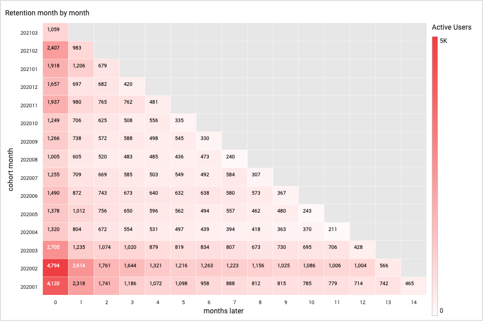
The numbers are dazzling when presented in that scale, but we can simplify the data by looking at first-month retention.
We can see, for example, that 4,120 users joined in January 2021. Of that cohort of 4,120, 2,318 returned the month after. That's a cohort retention rate of 56%.
Look, next, at February-March 2020: 4,794 users down to 2,614 — a 54% retention rate. If the March-April retention rate further drops — which it does, to 45% — we might conclude that our onboarding methods or introductory events are not sufficient in stoking ongoing interest in the platform. In other words, we are not making a good first impression.
Furthermore, a low first-month retention rate may suggest (as it commonly does, in our experience), that your onboarding processes require a greater level of personalisation and segmentation. Often, poor first-month retention is due to the following factors:
- Email sign-up journey is poorly designed or confusing
- There is little, if no, post-registration outreach
- New users are not segmented, and so do not receive personalised content or offers
- Users, if not segmented by registration date, are not properly followed up with by building management staff or community managers
If nothing else, keep cohort analysis in your back pocket as a good diagnostic tool for when registration slows down and usage stagnates. A two or three or four-month drop-off can usually be correlated directly to your engagement activities.
3. Activity at time of day
Do you know the time of day at which your tenants most prefer to:
- Log in to your platform?
- Read content?
- Browse your store?
- Order food?
- Comment on posts, or have conversations with fellow users?
If you said "no" to any or all of the questions above, you should take a closer look at activity sliced by time of day. By tracking the timing of user behaviour, you can uncover general habits that will help you to optimise your content and engagement strategies.
Let's look at content, in particular: Scheduling news articles or events during high-traffic periods ensures greater exposure and readership, and provides users a more refined experience. It also better validates the efforts of your content production and marketing teams.
High-traffic periods may not occur when you expect, so it's a good idea to consult your "activity at time of day" visualisation on a monthly basis.
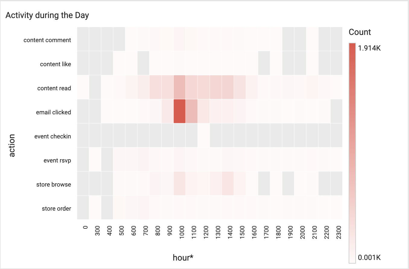
This analytic can help in other areas of tenant engagement, like e-commerce and retailer promotion. If you know, for instance, that users prefer to browse your store at the hours of 10am and 2pm, you can coordinate your onsite retailers and schedule offers and promotions at those times — or, conversely, you could promote products and services during periods where higher traffic (both physical and digital) is desired.
If you don't know the daily browsing habits of your users, down to the hour, you are making guesses, and risk running a sub-optimal engagement strategy that will disengage (see cohort retention) users over the long term.
Equiem's Core tenant experience platform solution comes with our Analytics Dashboards product, which provides you all of the analytics above (and many, many more). If you want more data, or need ways to optimise your successful engagement strategy, we can help. Book a consultation with us today.
Topics:
Engage


.jpg?width=461&height=400&name=Untitled%20presentation%20(1).jpg)